Details
- Client
- Casa & Anima
- Industry
- Luxury interior design
- Location
- Milan, Italy
- Services
- UX/UI · Website · Motion
- Stack
- Next.js · Motion · Lenis
- Year
- 2026
Introduction
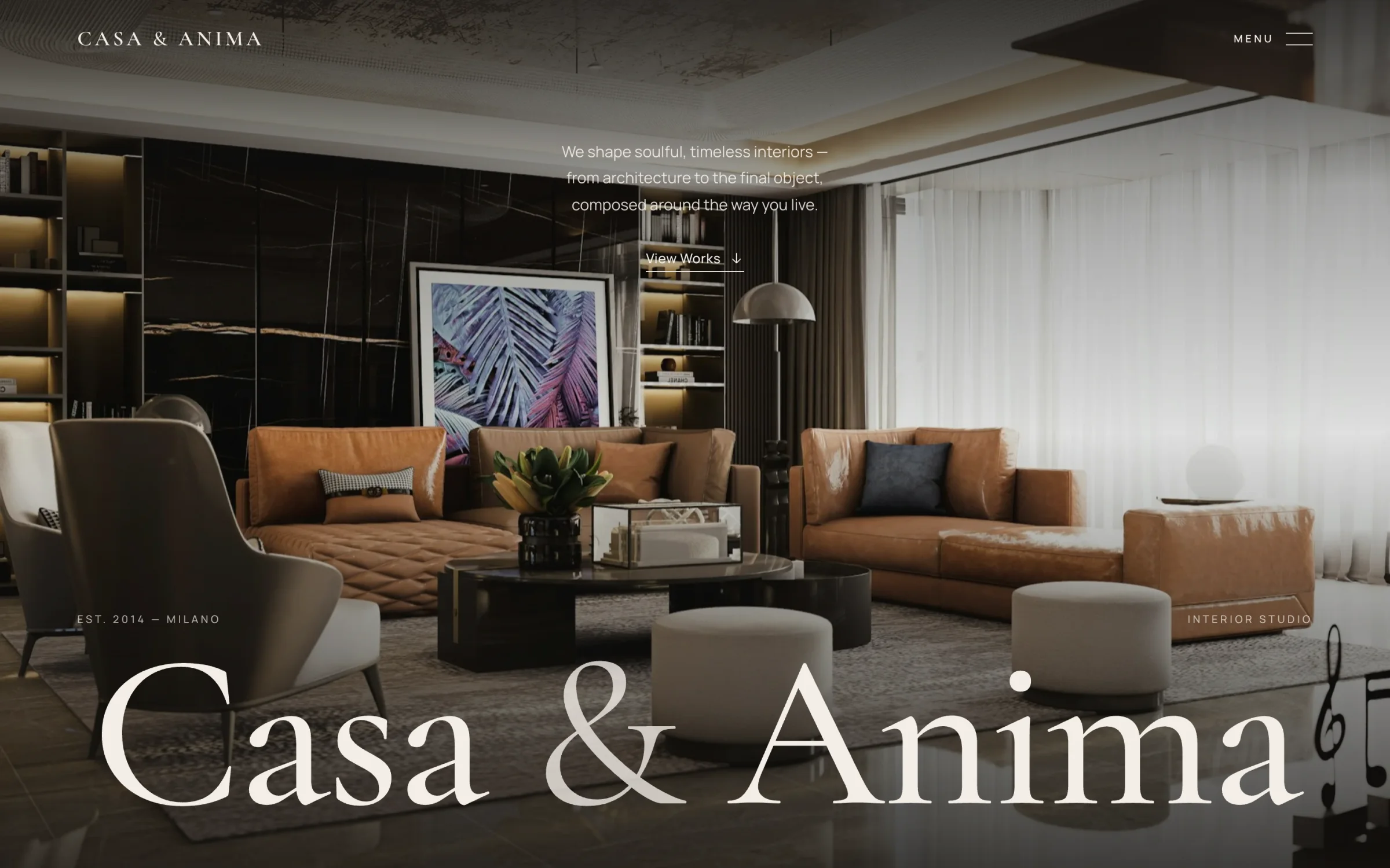
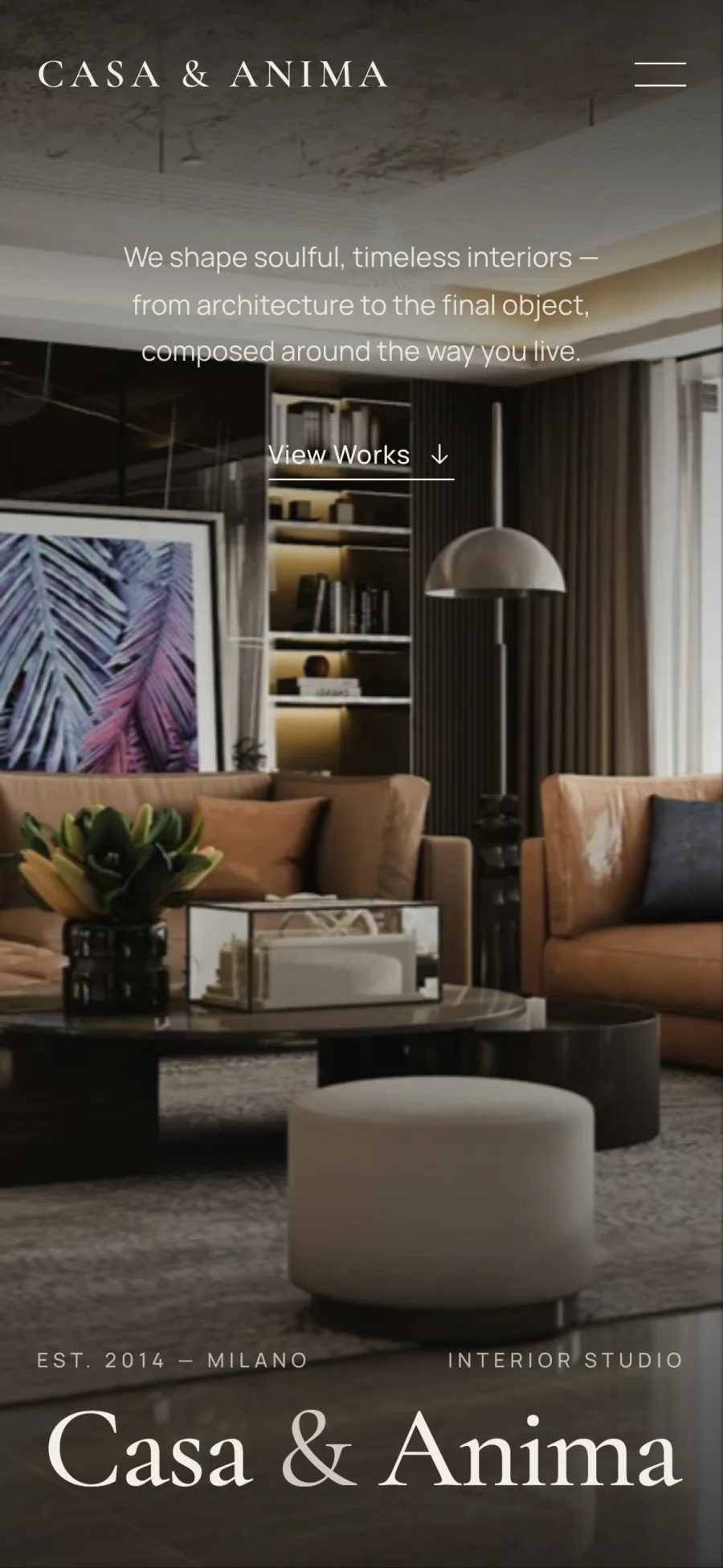
Casa & Anima design homes that feel calm, personal and made to last. They needed a website that felt the same way: one that moves at the pace of someone walking slowly through a finished room, and lets the photography do the talking.
A studio whose work spoke louder than its website
Casa & Anima came to us with a decade of finished homes, from villas on Lake Como to a penthouse in Milan and apartments from Paris to Copenhagen, and a website that showed none of it well. The photographs were beautiful. The template around them was not. Every project looked like the one before it, and nothing about the experience said quiet luxury.
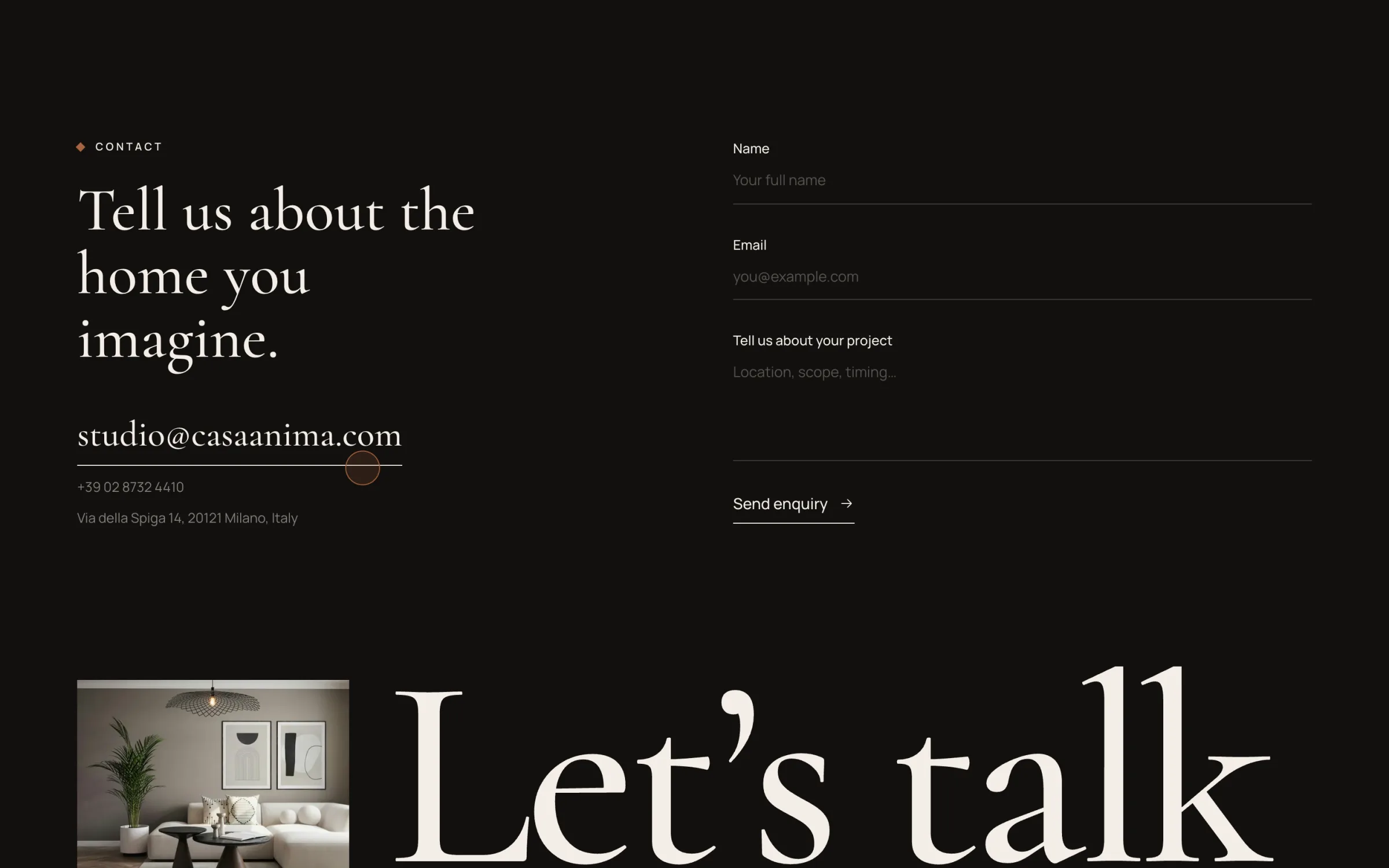
The brief fit in one sentence: make the site feel like walking into one of our homes. No noise, no gimmicks, nothing that competes with the rooms. Visitors should slow down, not rush through.
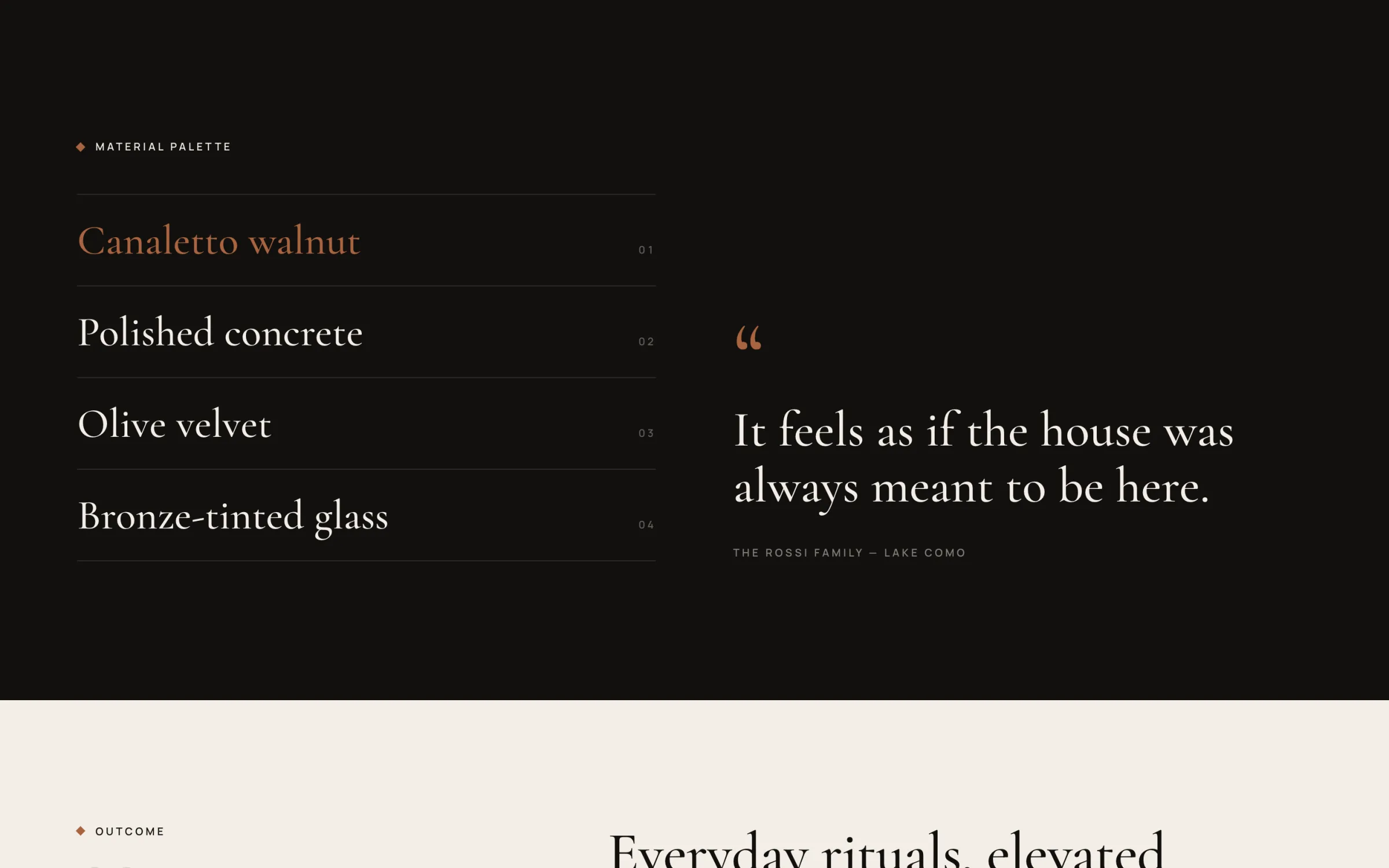
They were specific about a few things, and they held to them. The photography is never squeezed into tight thumbnails or buried under overlays. The type is upright only: a serif with real presence, and not a single italic anywhere on the site. And there is one accent colour, a warm bronze, used sparingly enough that it still means something.
Treating pace as a design material
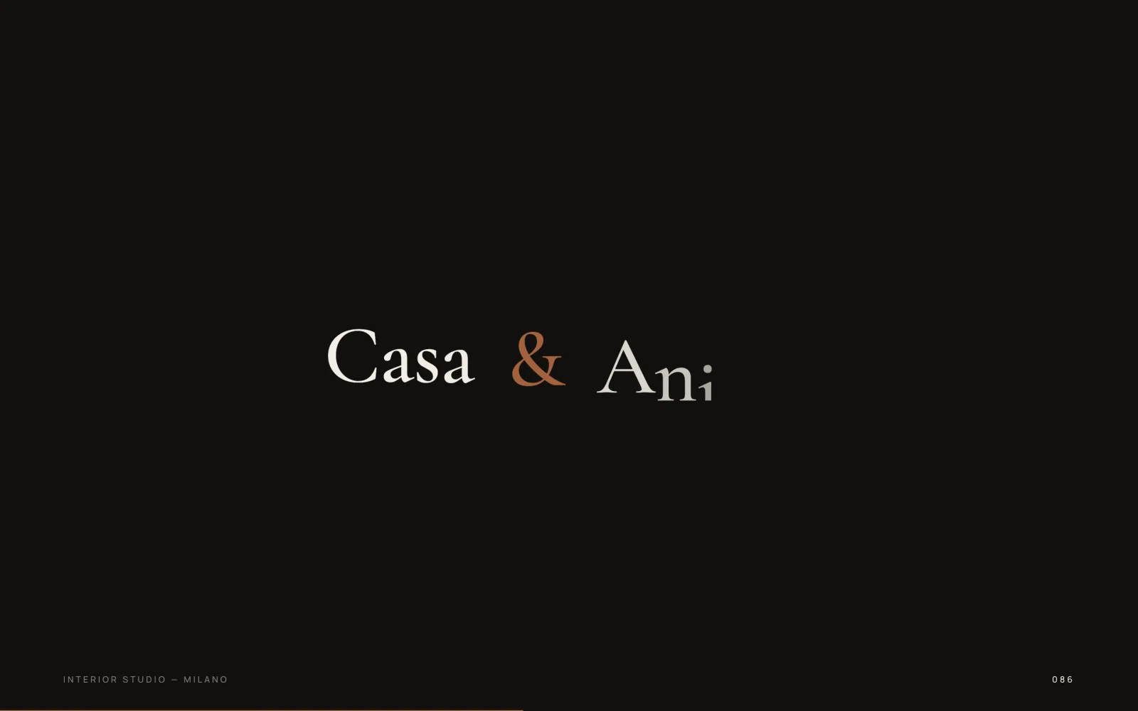
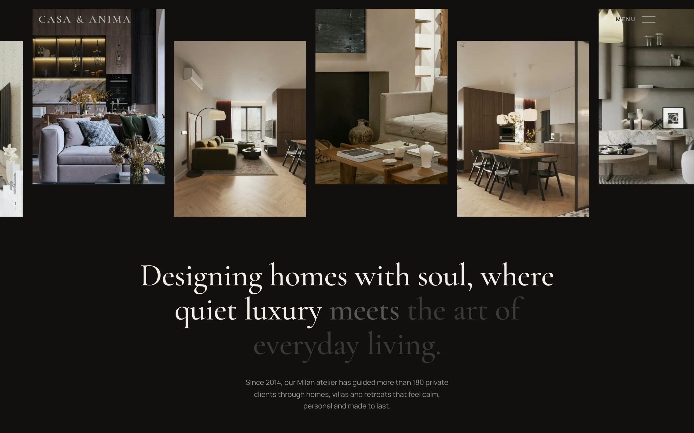
We treated scrolling the way an interior designer treats a hallway: as the thing that sets the rhythm between rooms. The home page opens on the preloader, then holds a full-bleed photograph in place while the next section rises over it, slowly dimming and zooming the room underneath.
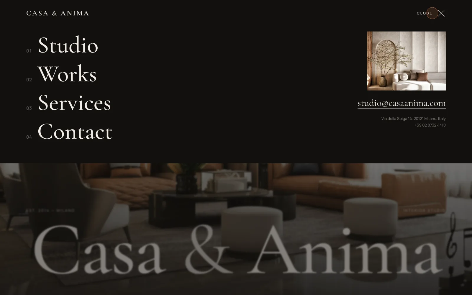
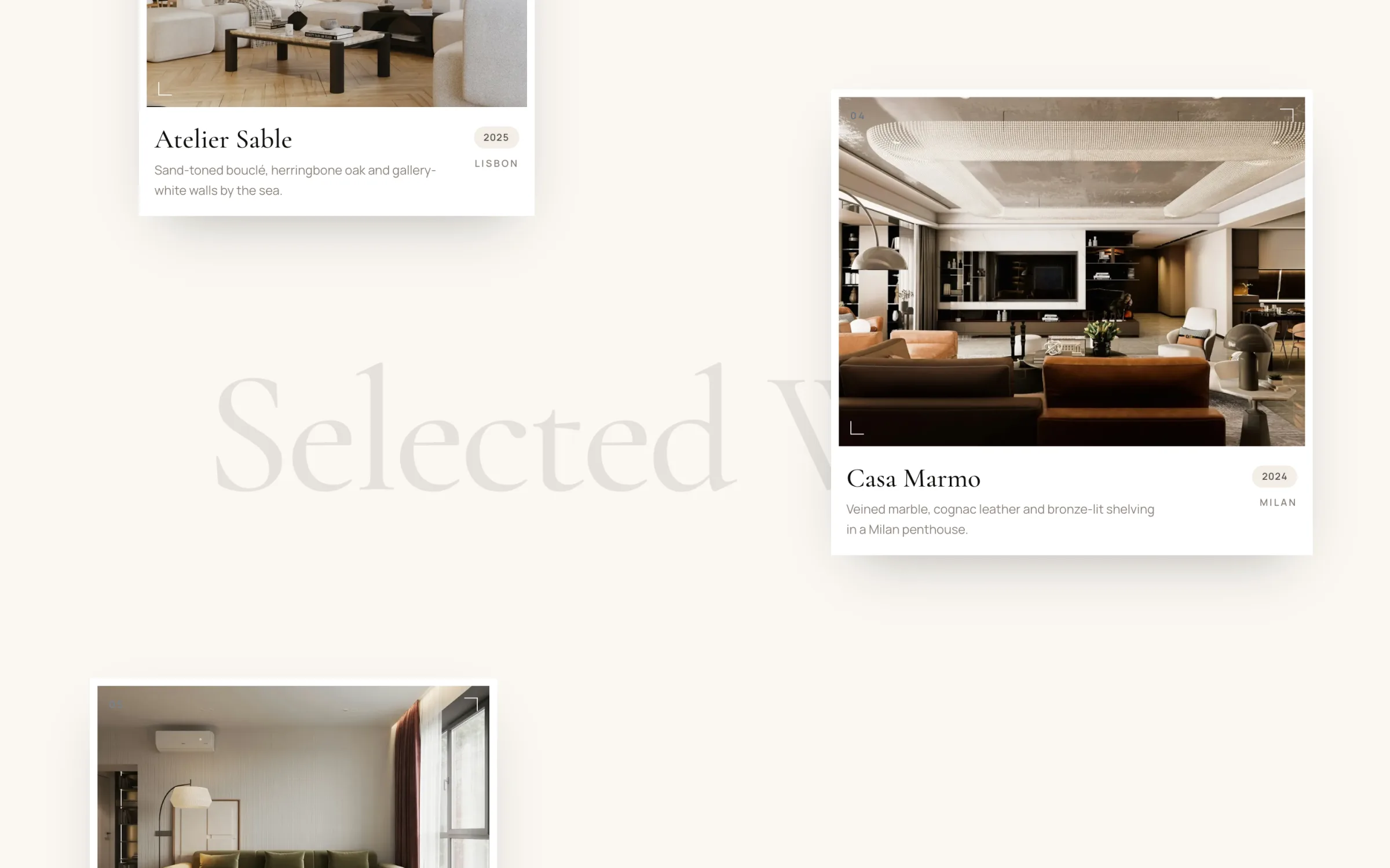
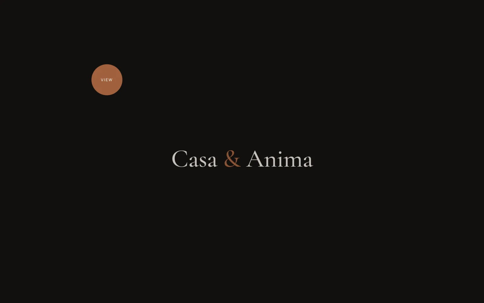
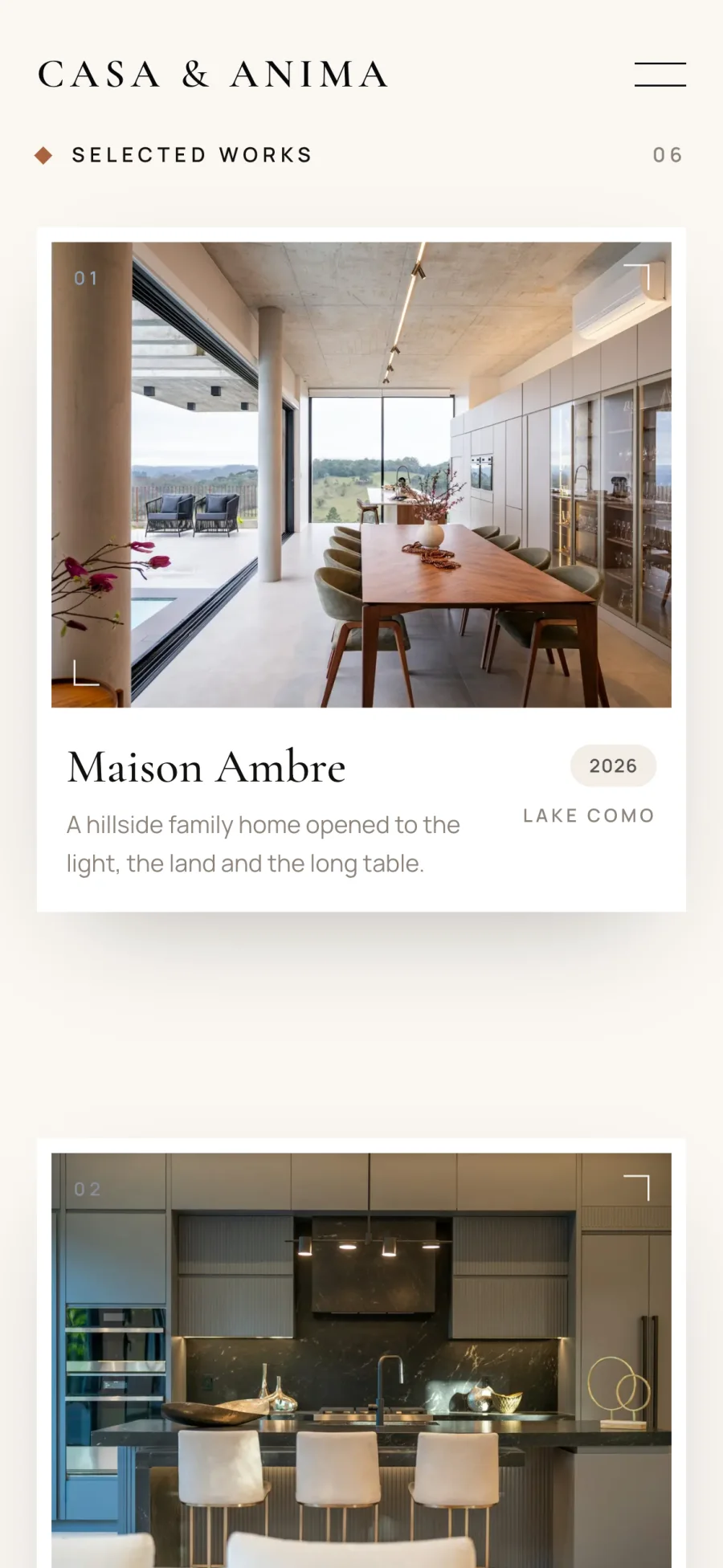
From there, each section has its own movement. The studio gallery drifts sideways. Selected Works is a loose collage of framed cards gliding over a giant pinned title, each at its own speed, so the page feels layered rather than stacked. Between pages, an ink curtain carrying the studio name rises and falls, so a project never just snaps into view.
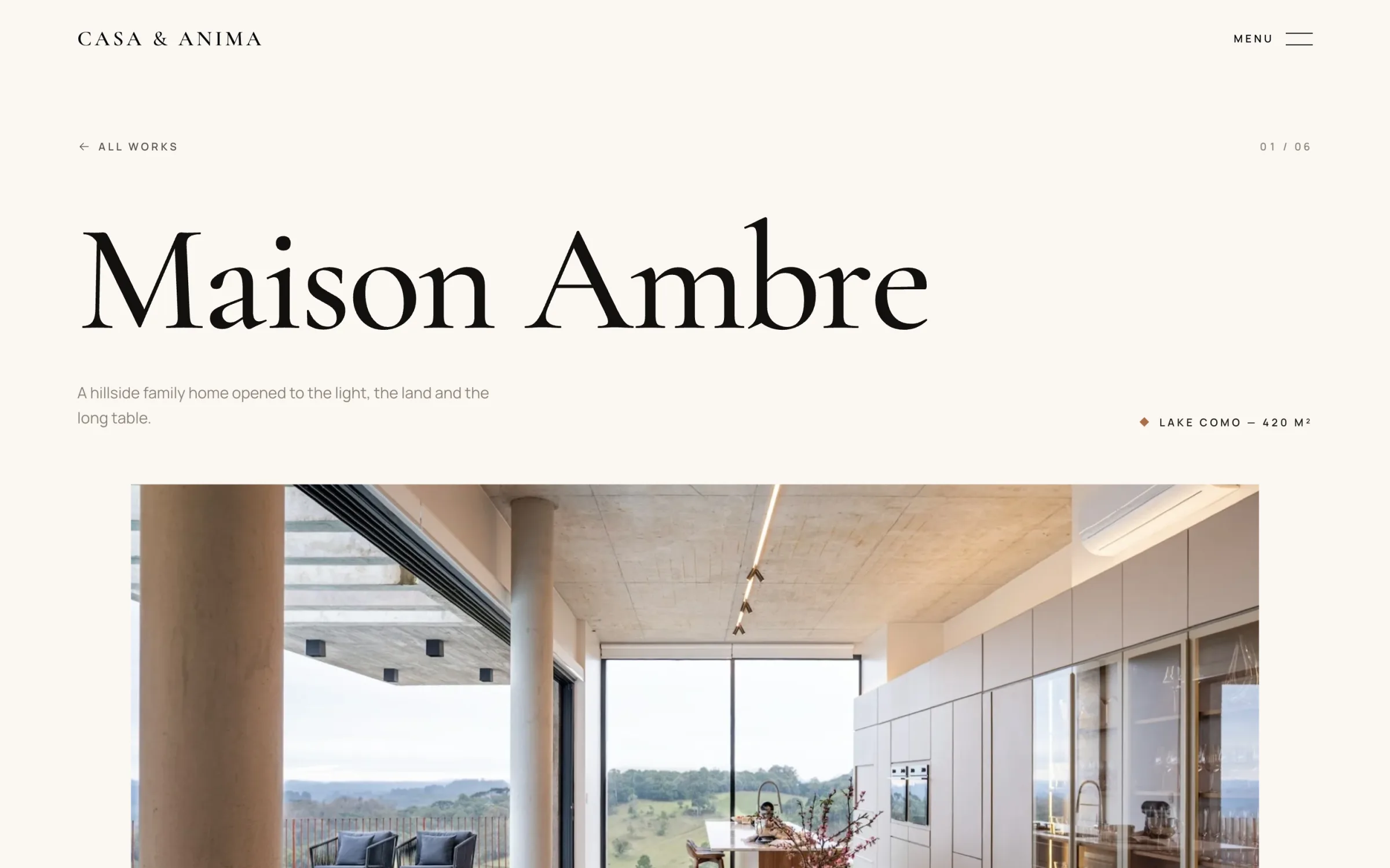
Every project gets a full editorial page: a title that sharpens out of a blur, an image that opens from a narrow strip, the story told as intro, challenge and outcome, framed feature photographs, and the material palette beside a word from the client.
Typography carries the rest. Cormorant Garamond for display, Manrope for body copy, generous leading and plenty of empty space. With every animation switched off, the site still reads like a printed monograph.
Making slow feel smooth on every screen
Slow, cinematic motion is unforgiving. If it stutters even slightly, the calm the client asked for turns into something that feels broken. Most of our engineering time went into three problems a visitor will never notice, which is exactly the point.
Scrolling that fought back on iPhone
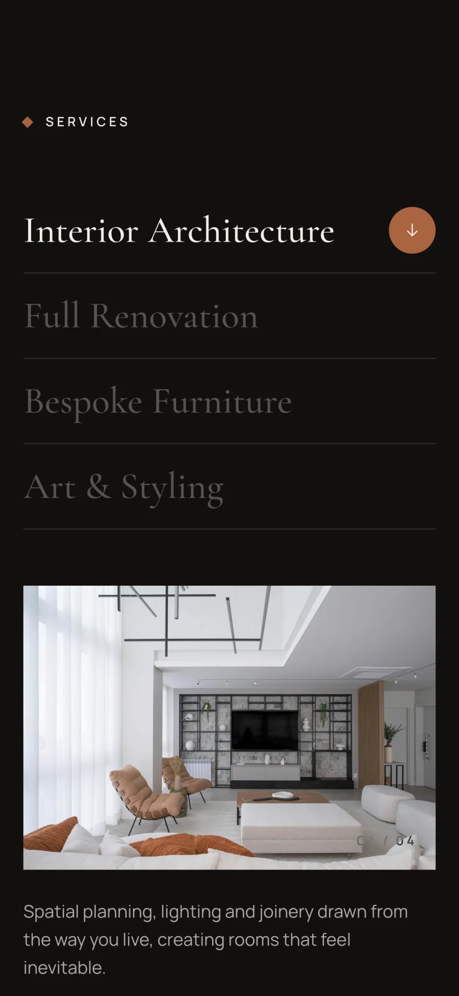
Smooth scrolling felt wonderful with a trackpad, but on iOS Safari it slowly fell out of step with the browser's own scrolling (status-bar taps, toolbar resizes, momentum) and could drag the page back to an old position. We kept smooth scrolling for mouse and trackpad users and gave phones and tablets native scrolling, which is what touch already does best.
Parallax that lagged a frame behind
Parallax driven by JavaScript runs one frame behind the scroll, and on a phone you can see it as a faint jitter. We rebuilt every drift, zoom and fade on native CSS scroll-driven animations, which move in lockstep with the page. Browsers that do not support them yet get a JavaScript fallback on desktop and a still, composed layout on touch.
Ghost images in the services list
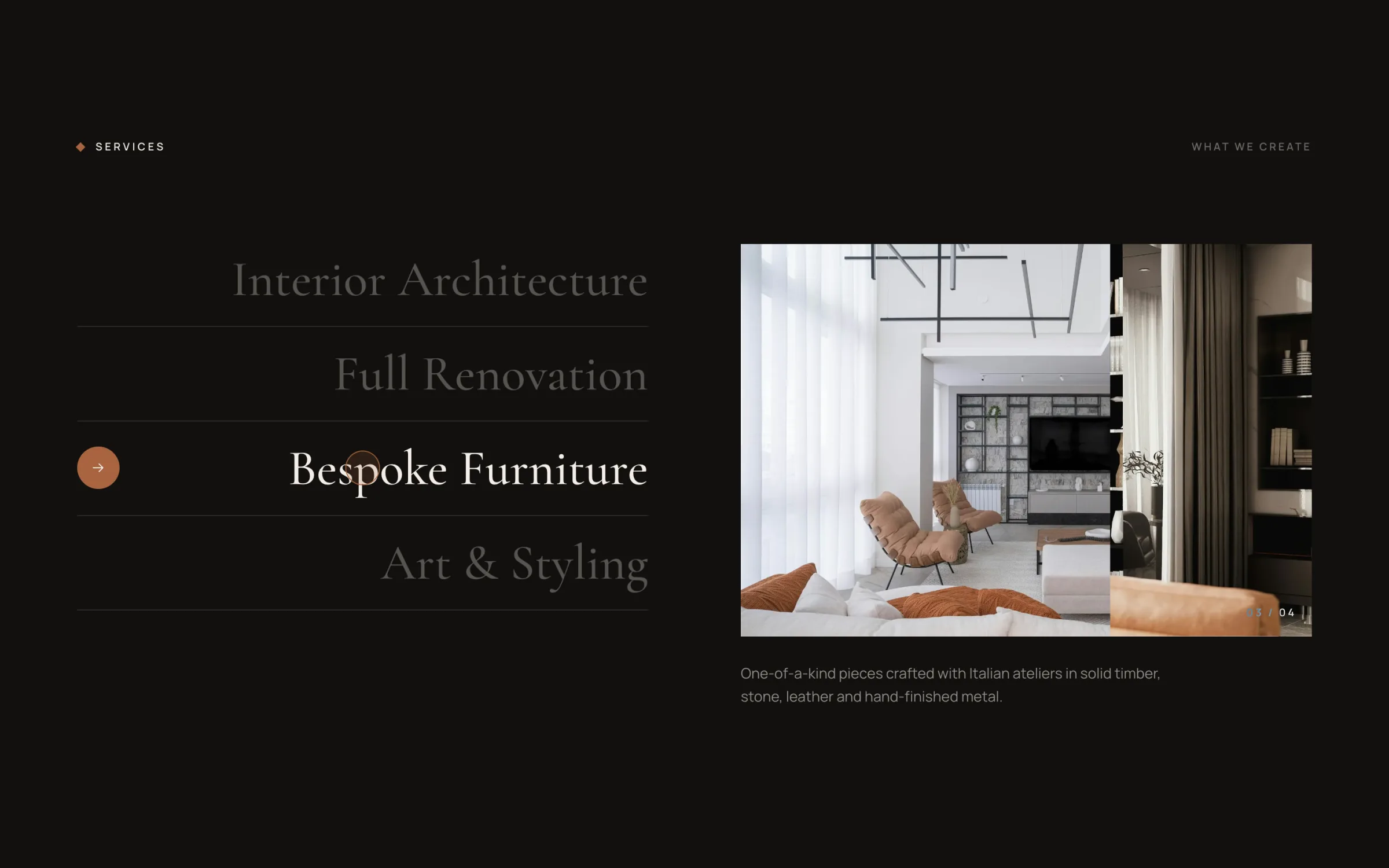
Sweeping the cursor quickly across the services left half-faded photographs stacked on top of each other. Now every photograph stays loaded, the chosen one moves to the top and wipes in over the last, and a short hover-intent delay stops a quick sweep from firing a wipe for every row.
A website that feels like their homes
Casa & Anima now have a site they are proud to send to new clients: six projects, each with its own story, a home page with a real sense of arrival, and motion that stays calm on every screen we tested.
Under the surface it is just as considered. The site is fully static, with per-page metadata, share images generated for every page, a sitemap and structured data for the studio, its projects and its FAQ, so the work is as easy to find as it is to look at.
For us, the project was a reminder that restraint is a technical problem as much as a design one. The quieter the interface, the more every detail shows, and the more the work underneath has to be right.
- Performance on desktop
- 100
- Performance on mobile
- 93
- SEO
- 100
- Layout shift on mobile
- 0
MORE WORK
You might also like
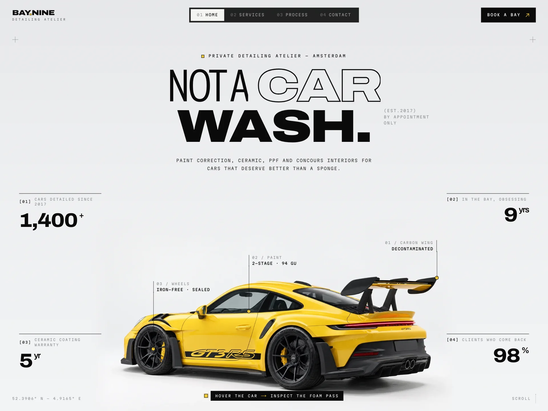
Bay.Nine
Website and booking flow for an Amsterdam detailing atelier, where the car is washed live as you scroll.
- UX/UI
- Website
- Branding
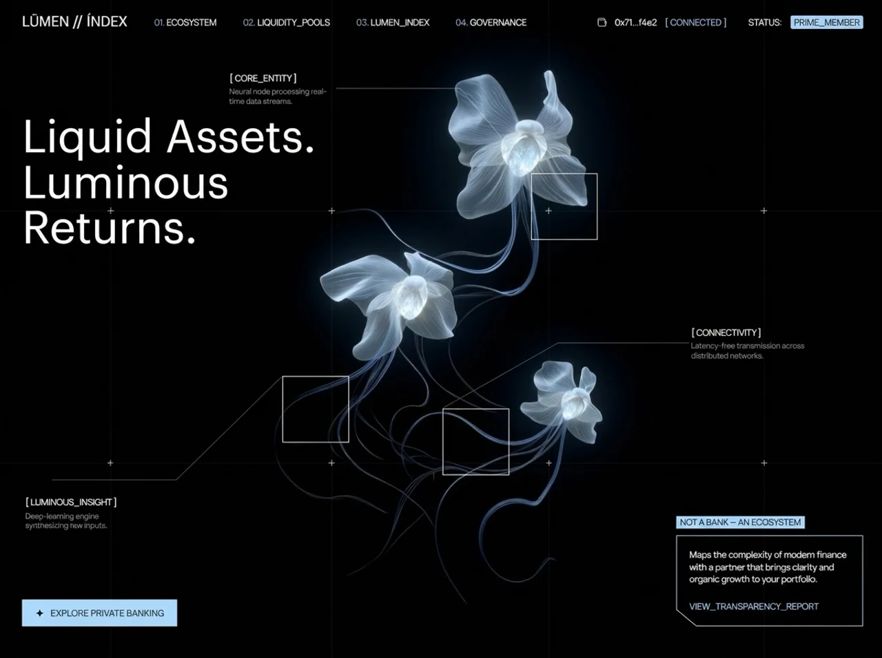
Lümen Index
Private banking and DeFi ecosystem bringing clarity to liquidity, governance and modern portfolios.
- UX/UI
- Website
- Branding